

Digital Magic is the alias I chose to promote myself as a designer. I know, my last name is much easier to pronounce and spell, but hey... I thought Digital Magic would be more suitable. Below you can see all the elements forming the branding (the logo, icons, stationary, wallpaper and the website).
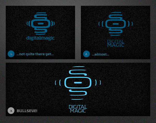
As a designer, I always aim to create memorable and easily recognizable pieces of design, wether it be a branding or an artwork. Which is also what the Digital Magic-logo should reflect and why it looks the way it does: like a part of a computerboard. It illustrates the process of forming inspiration and thoughts into an idea and the search for that certain point where you think: bullseye! And with that in mind, it also gives meaning to the "Digital" in Digital Magic. The color-choices and use of custom-made tribals and glow-effects do the same to put "Magic" on your mind.
As a designer, I always aim to create memorable and easily recognizable pieces of design, wether it be a branding or an artwork. Which is also what the Digital Magic-logo should reflect and why it looks the way it does: like a part of a computerboard. It illustrates the process of forming inspiration and thoughts into an idea and the search for that certain point where you think: bullseye! And with that in mind, it also gives meaning to the "Digital" in Digital Magic. The color-choices and use of custom-made tribals and glow-effects do the same to put "Magic" on your mind.
Choosing the font was easy. Kontrapunkt (downloadable here) has long been one of my favourite typefaces. It's a great mix of traditional and modern, a combination I've always liked. And as someone who not only uses digital but also traditional media, it kinda was an obvious choice. It also didn't hurt that it's free and an award-winner. I like it so much in fact, that I decided to work with some of the letters to create the logomark (the lowercase "g" being a special favourite of mine).
It is my personal belief, that a font can make or break your design. A bad font-choice can make even the best artwork seem cheap, whereas the right one can magically (scnr) uplift it to artistic heights never seen before. It's the milk to your cornflakes, the Martin Scorsese to your mafia movies, the "i" to your Phone, it's your better half! Alright, I might be exaggerating a bit, but you get the point.
The rest should be pretty self-explanatory and I hope you enjoy it. If you do so, I would appreciate you appreciating it. Thank you very much!
The rest should be pretty self-explanatory and I hope you enjoy it. If you do so, I would appreciate you appreciating it. Thank you very much!
INITIAL LOGO-SKETCHES

LOGO-FINE-DRAWING


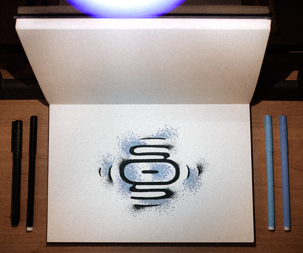
some super-dramatic shots of the final logo-drawing
ANATOMY OF THE LOGO


Super-dramatic. Yet again!


LOGO-TRANSFORMATION
Thank you, Weight-Watchers!
AREAS OF EXPERTISE


THE FONT

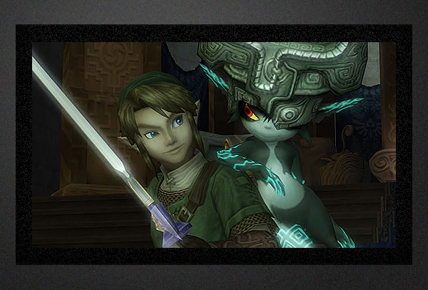
INSPIRATION

Computer Main-Board
Notice the tribals? I did!
[The Legend of Zelda - Twilight Princess]
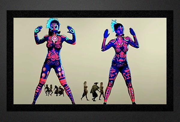
...tribals, tribals, tribals...
[Kanye West - Love Lockdown]
STATIONARY

spot-uv-printing ftw!


WALLPAPERS


WEBSITE


soon online!


